Neighborly
As part of my studies, I was tasked with designing a responsive one-page website for a physical product. Drawing on my passion for interior design and lighting design, I chose the iconic PH5 lamp by Louis Poulsen as the focal point for my project.
Neighborly
As part of my studies, I was tasked with designing a responsive one-page website for a physical product. Drawing on my passion for interior design and lighting design, I chose the iconic PH5 lamp by Louis Poulsen as the focal point for my project.
Neighborly
As part of my studies, I was tasked with designing a responsive one-page website for a physical product. Drawing on my passion for interior design and lighting design, I chose the iconic PH5 lamp by Louis Poulsen as the focal point for my project.
Neighborly
As part of my studies, I was tasked with designing a responsive one-page website for a physical product. Drawing on my passion for interior design and lighting design, I chose the iconic PH5 lamp by Louis Poulsen as the focal point for my project.
Type:
Figma
Context:
Principle Designer
Year:
2021
Type:
Figma
Context:
Principle Designer
Year:
2021
Type:
Figma
Context:
Principle Designer
Year:
2021
Type:
Figma
Context:
Principle Designer
Year:
2021
Background
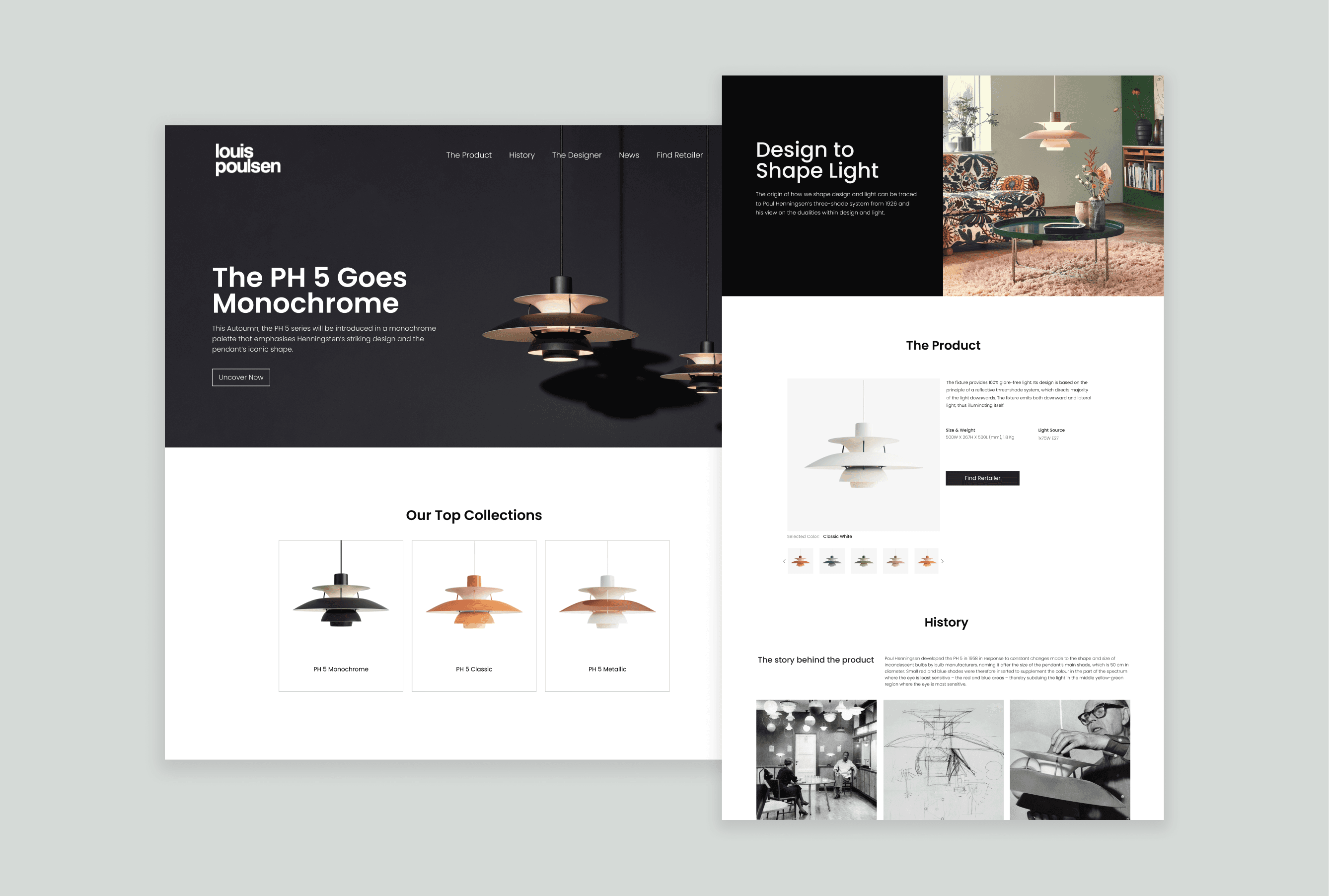
In this case study, we will explore the process and rationale behind the design of a landing page for the iconic PH5 lamp, designed by Louis Poulsen. The goal of this project was to create an immersive and visually appealing online experience that showcases the lamp's unique design features, highlights its functionality, and captures the essence of mid-century Nordic interior design.
User Scenario
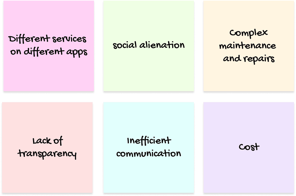
Pain Points
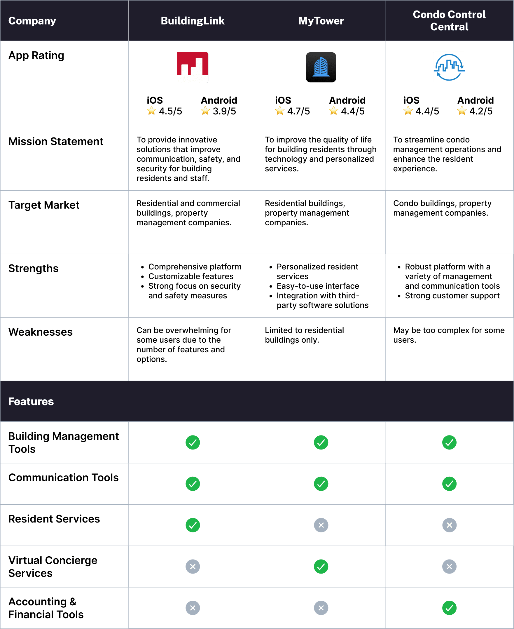
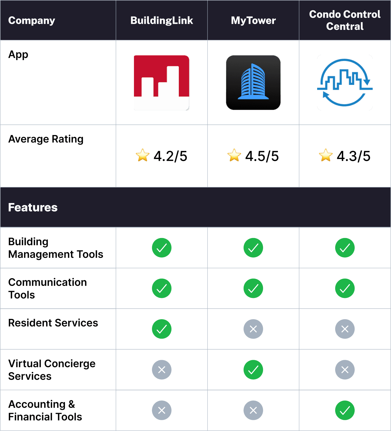
Competitive Analysis
100% of the interviewers confirmed that they use WhatsApp as their primary means of communication with both their neighbors and the building staff.
I also did a deep dive into the existing leading apps in the market, to identify the features that would set Neighborly apart.
100% of the interviewers confirmed that they use WhatsApp as their primary means of communication with both their neighbors and the building staff.
I also did a deep dive into the existing leading apps in the market, to identify the features that would set Neighborly apart.
100% of the interviewers confirmed that they use WhatsApp as their primary means of communication with both their neighbors and the building staff.
I also did a deep dive into the existing leading apps in the market, to identify the features that would set Neighborly apart.
100% of the interviewers confirmed that they use WhatsApp as their primary means of communication with both their neighbors and the building staff.
I also did a deep dive into the existing leading apps in the market, to identify the features that would set Neighborly apart.
UI Design
As part of the competitive analysis, I couldn't help but notice that most of them had outdated and unfriendly designs.
So, my goal was to give Neighborly a fresh, clean yet playful design, making the operations as simple and convenient as possible.
Theme
I created two versions of the app's design - light mode and dark mode - and users can select the one they prefer. In this case study, I'll showcase the dark one as it was more challenging for me to design, and I'm especially proud of how it turned out. 😁
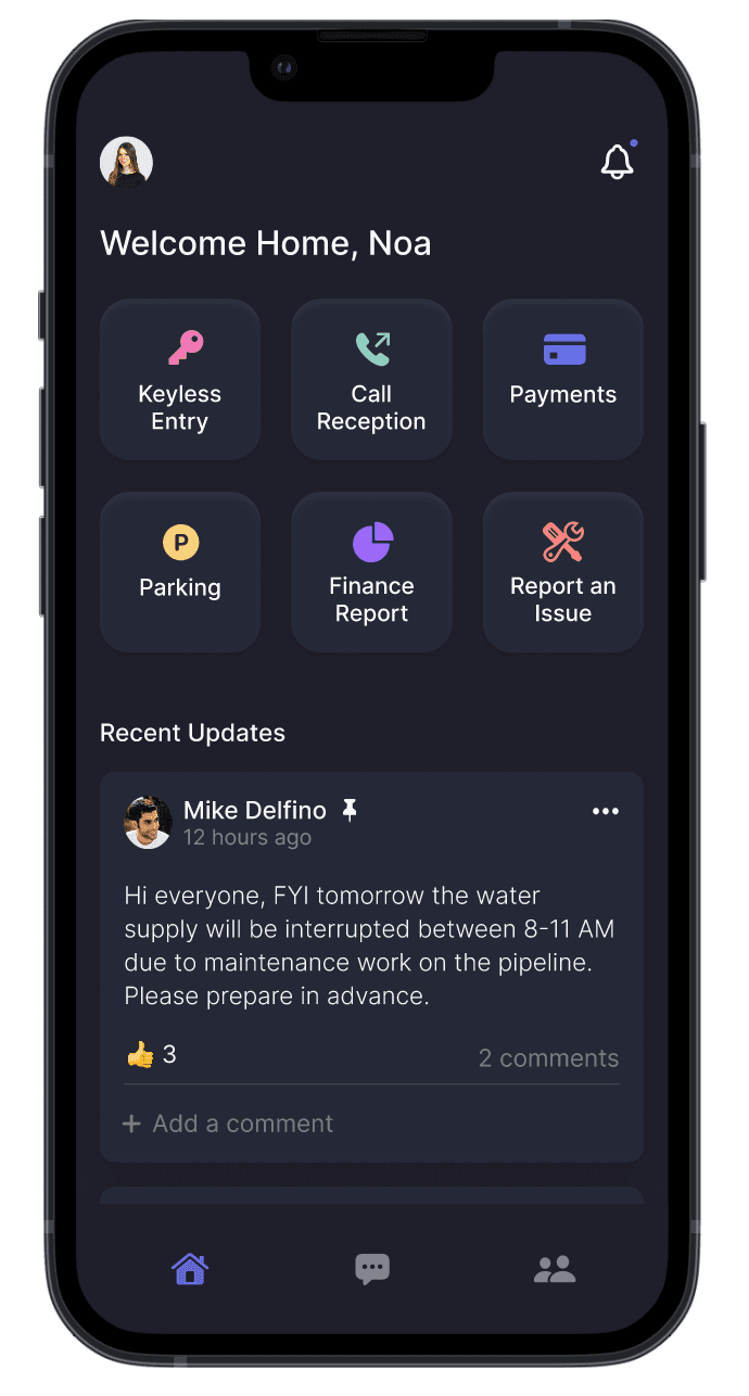
Home Page
Through the quick action panel, users can get a lot done without having to navigate all over the place. There's also a social feed where neighbors can catch up with each other, share updates, answer surveys and more. Important messages can be pinned.
Payment
In the payment section, users can submit their fees online, along with the ability to effortlessly access their payment history and download receipts for their records.
Parking
In the parking section, residents can swap parking spaces with one another, making it more convenient for those who have different parking needs. Next steps could involve adding a gamification element to this section, such as earning points for accepting others' requests. This would provide an incentive for users to engage with this feature regularly and enhance their overall experience.
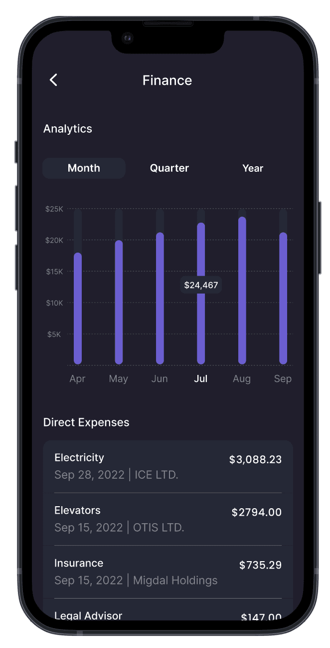
Finance Dashboard
The finance section provides residents with a clear overview of the building's income and expenses, promoting transparency and enabling them to better understand the financial health of the community.
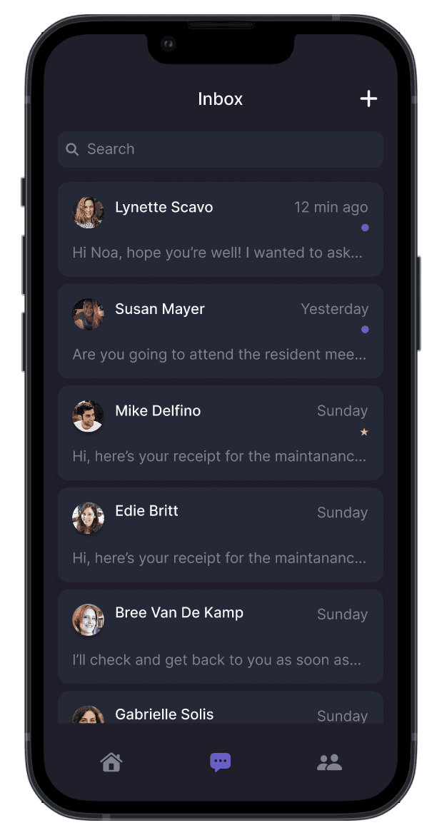
Direct Messages
Residents can communicate with each other privately and securely, making it easier to coordinate events or discuss community issues.
UI Design
As part of the competitive analysis, I couldn't help but notice that most of them had outdated and unfriendly designs.
So, my goal was to give Neighborly a fresh, clean yet playful design, making the operations as simple and convenient as possible.
Theme
I created two versions of the app's design - light mode and dark mode - and users can select the one they prefer. In this case study, I'll showcase the dark one as it was more challenging for me to design, and I'm especially proud of how it turned out. 😁
Home Page
Through the quick action panel, users can get a lot done without having to navigate all over the place. There's also a social feed where neighbors can catch up with each other, share updates, answer surveys and more. Important messages can be pinned.
Payments
In the payment section, users can submit their fees online, along with the ability to effortlessly access their payment history and download receipts for their records.
Parking
In the parking section, residents can swap parking spaces with one another, making it more convenient for those who have different parking needs. Next steps could involve adding a gamification element to this section, such as earning points for accepting others' requests. This would provide an incentive for users to engage with this feature regularly and enhance their overall experience.
Finance Dashboard
The finance section provides residents with a clear overview of the building's income and expenses, promoting transparency and enabling them to better understand the financial health of the community.
Direct Messages
Residents can communicate with each other privately and securely, making it easier to coordinate events or discuss community issues.
UI Design
As part of the competitive analysis, I couldn't help but notice that most of them had outdated and unfriendly designs.
So, my goal was to give Neighborly a fresh, clean yet playful design, making the operations as simple and convenient as possible.
Theme
I created two versions of the app's design - light mode and dark mode - and users can select the one they prefer. In this case study, I'll showcase the dark one as it was more challenging for me to design, and I'm especially proud of how it turned out. 😁

Home Page
Through the quick action panel, users can get a lot done without having to navigate all over the place. There's also a social feed where neighbors can catch up with each other, share updates, answer surveys and more. Important messages can be pinned.
Payments
In the payment section, users can submit their fees online, along with the ability to effortlessly access their payment history and download receipts for their records.
Parking
In the parking section, residents can swap parking spaces with one another, making it more convenient for those who have different parking needs. Next steps could involve adding a gamification element to this section, such as earning points for accepting others' requests. This would provide an incentive for users to engage with this feature regularly and enhance their overall experience.
Finance Dashboard
The finance section provides residents with a clear overview of the building's income and expenses, promoting transparency and enabling them to better understand the financial health of the community.
Direct Messages
Residents can communicate with each other privately and securely, making it easier to coordinate events or discuss community issues.
Key Takeways & Next Steps
While the app hasn't been developed and used, this case study showcases its potential to transform residents' interactions and experiences.
Moving forward, next steps would involve testing the app's functionality and usability, as well as adding some additional gamification elements.
While the app hasn't been developed and used, this case study showcases its potential to transform residents' interactions and experiences. Moving forward, next steps would involve testing the app's functionality and usability, as well as adding some additional gamification elements.
While the app hasn't been developed and used, this case study showcases its potential to transform residents' interactions and experiences. Moving forward, next steps would involve testing the app's functionality and usability, as well as adding some additional gamification elements.
While the app hasn't been developed and used, this case study showcases its potential to transform residents' interactions and experiences. Moving forward, next steps would involve testing the app's functionality and usability, as well as adding some additional gamification elements.